
Zapier · Design system
Dark mode
for Zapier.
Introducing a dark theme that preserves hierarchy, accessibility, and brand character across a large, information-dense product platform.
- Challenge
- Create a resilient theme across varied product surfaces
- Contribution
- Visual direction, semantic color system, product application
- Scope
- Theme foundations and representative platform experiences
01 · The systems problem
Change the atmosphere without losing the product.
Zapier contains dense builders, long forms, tables, navigation systems, and countless states. A dark theme had to work across all of them while preserving the hierarchy people had already learned in the light experience.
The core challenge was semantic, not cosmetic. Every surface, border, text treatment, status color, and interactive state needed a dependable relationship to its surroundings. Simply replacing light values with dark ones would flatten the interface and produce unpredictable contrast.
A theme is successful when the product still feels like itself—only better suited to a different environment.
02 · Theme foundations
Build relationships, not a second palette.
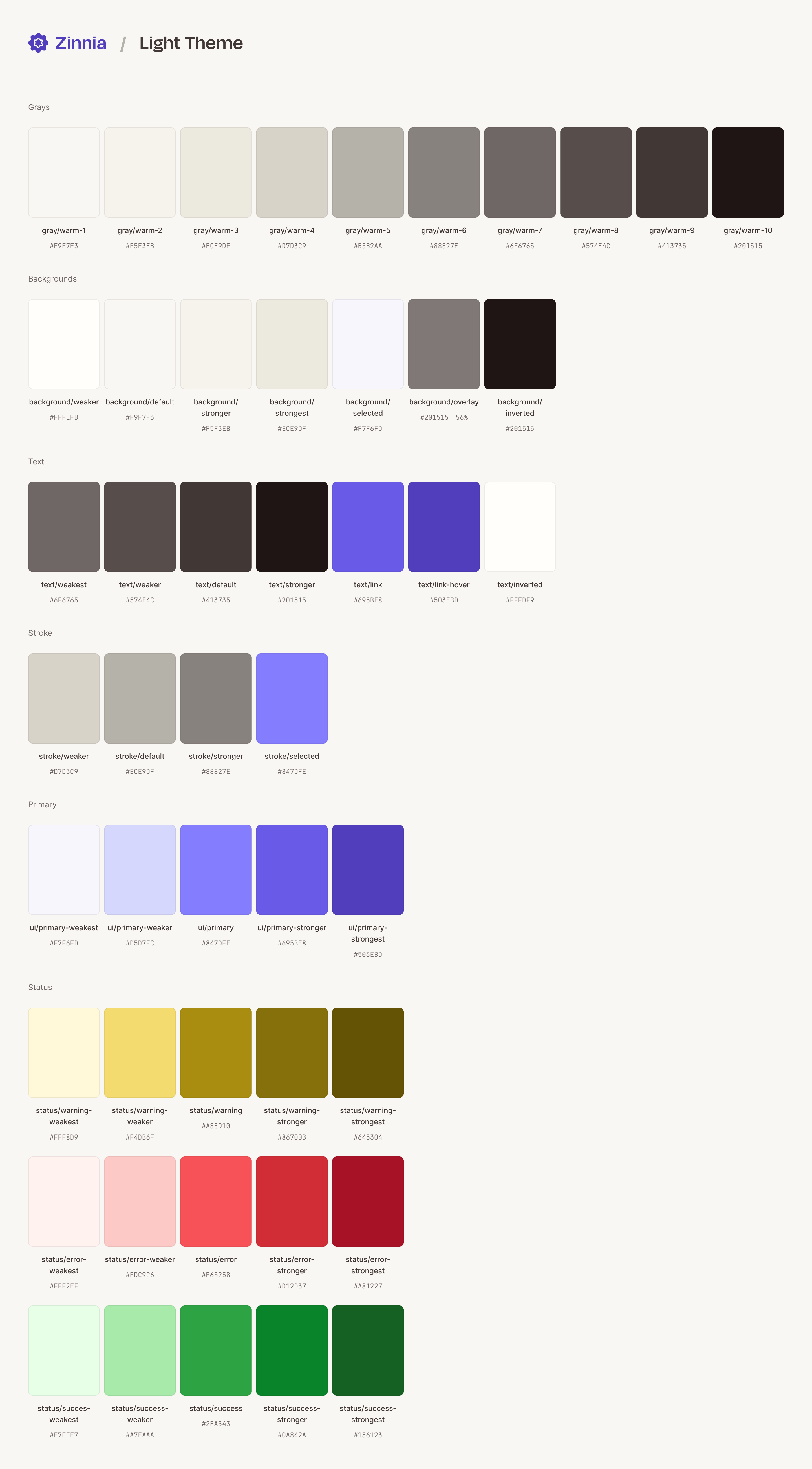
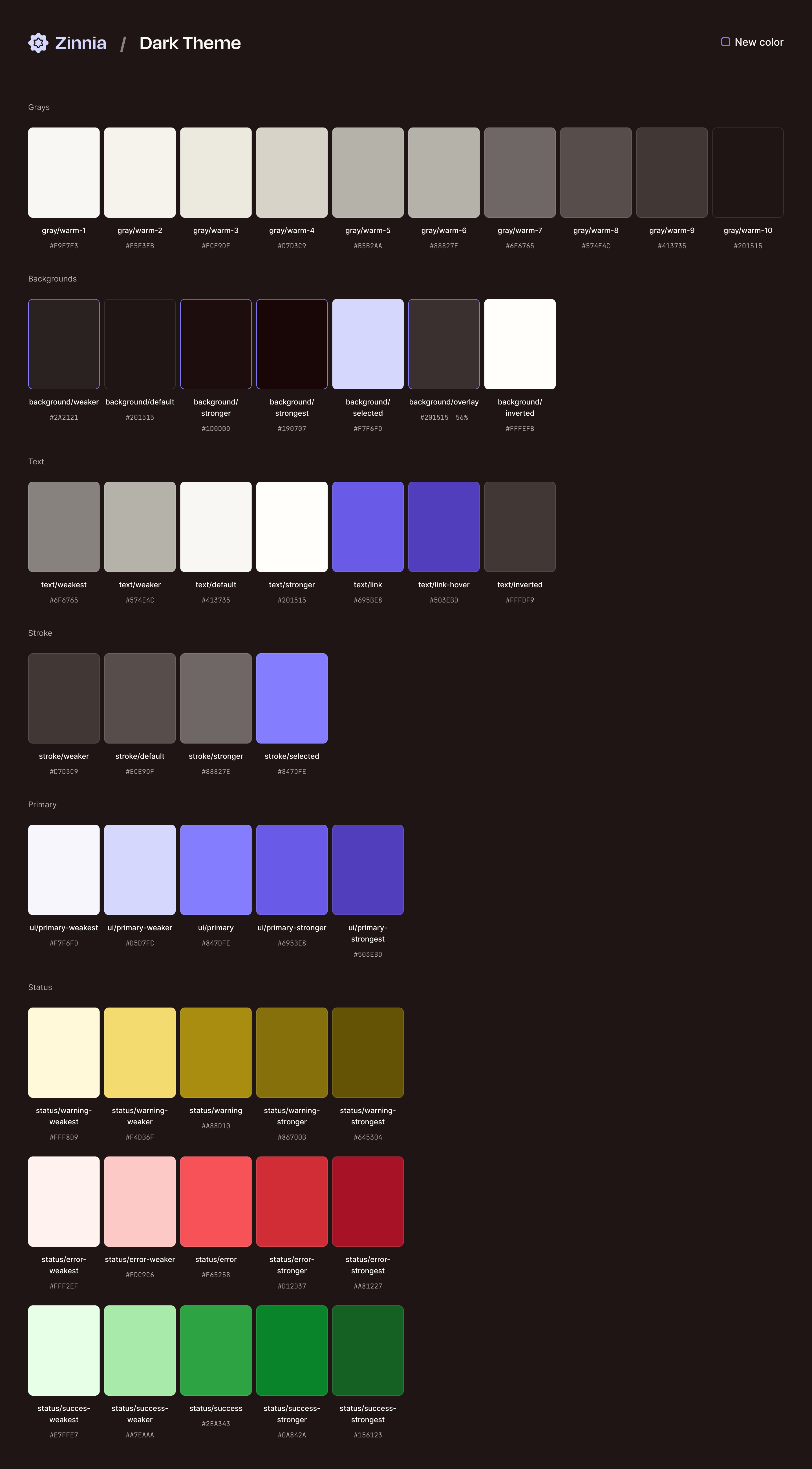
The foundation pairs light and dark values by role: default and raised surfaces, subtle and strong borders, primary and secondary text, interactive emphasis, and semantic feedback. Each token communicates purpose instead of a fixed visual value.
That structure lets components change theme without accumulating local overrides. It also makes contrast decisions repeatable, giving designers and engineers a shared model for extending the system.
03 · Preserve hierarchy
Use depth deliberately in a dense builder.
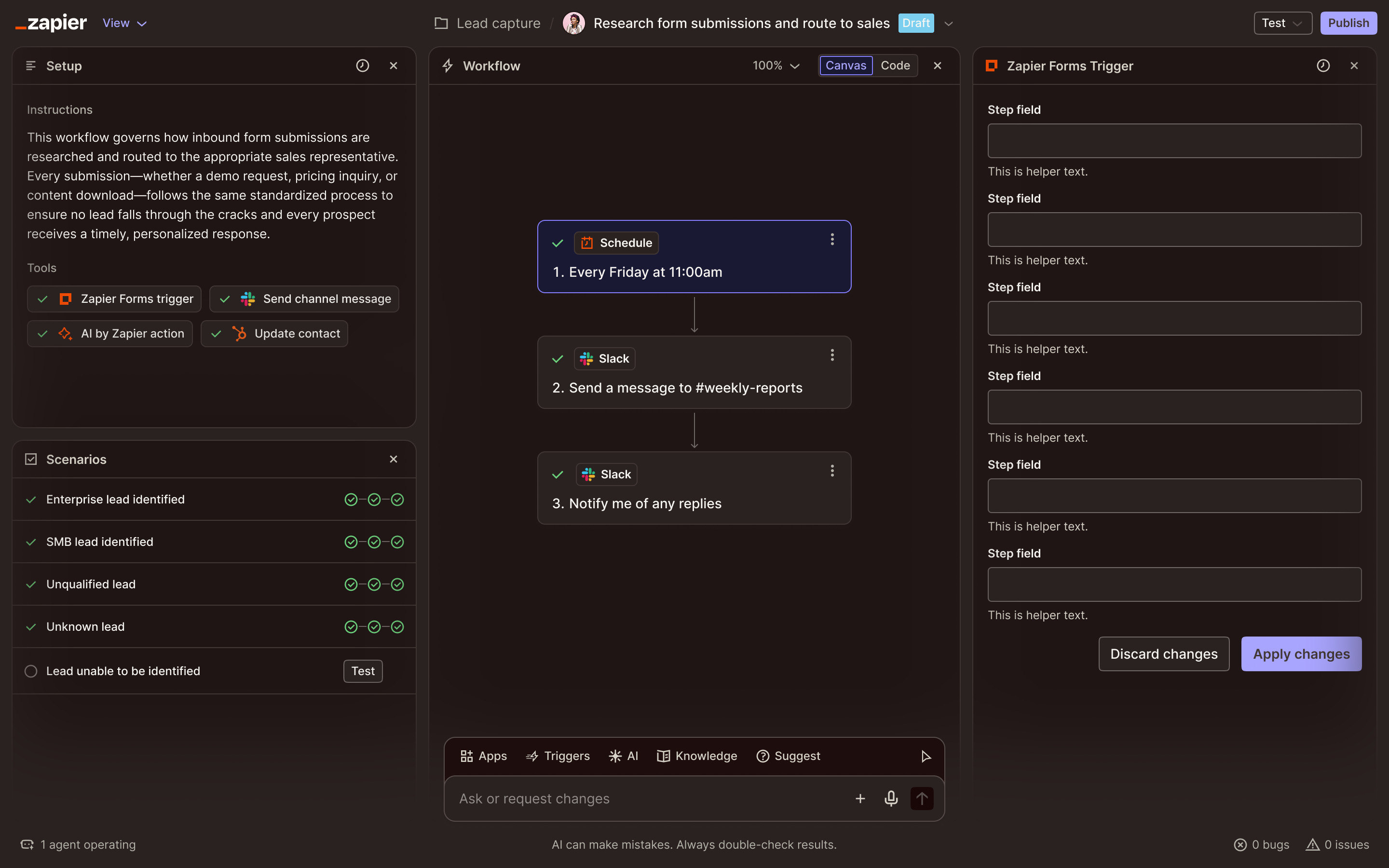
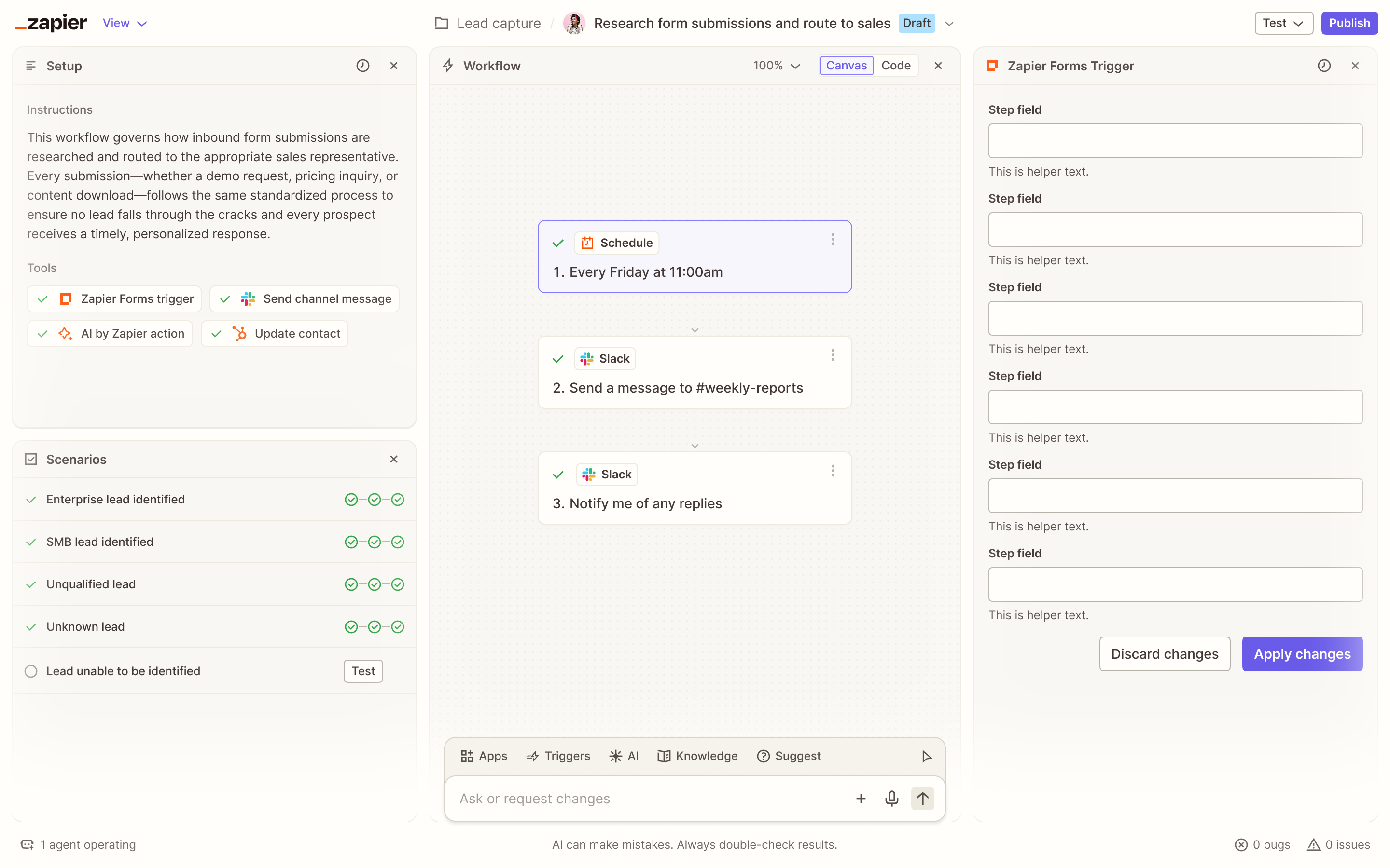
The workflow builder combines navigation, instructions, a canvas, configuration panels, status messaging, and an AI composer. In light mode, much of that hierarchy comes from subtle gray surfaces. The dark version needed equivalent separation without turning every region into a visible box.
Controlled surface elevation, restrained borders, and selective color preserve attention on the workflow itself. Brand and status colors remain recognizable, but their luminance is adjusted so they do not vibrate against the darker environment.
04 · Test across surface types
Prove the system beyond the ideal screen.
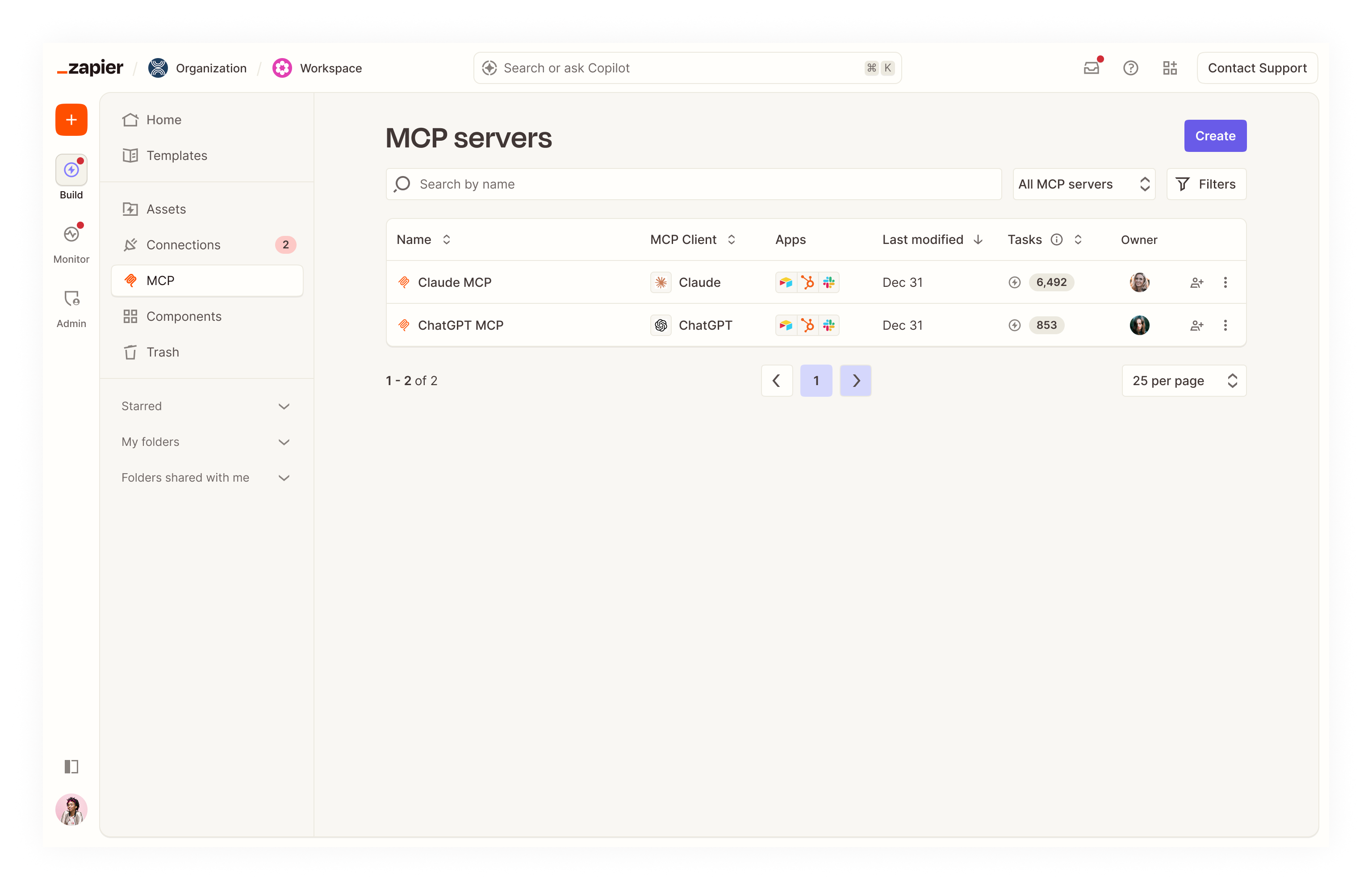
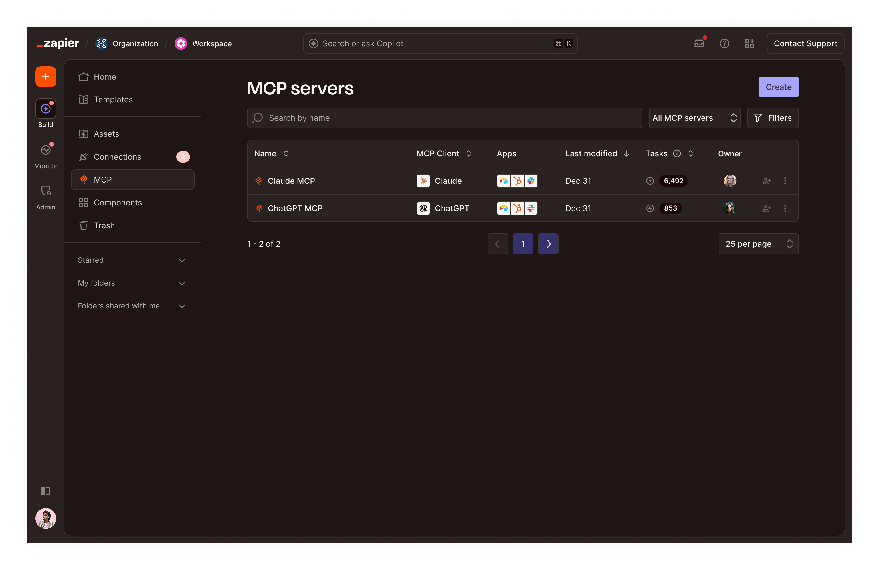
Builders reveal depth and state; listings reveal repetition, density, and scanning behavior. Applying the theme to both exposed different weaknesses and prevented the foundational work from overfitting to a single flagship experience.
The listing view tested persistent navigation, search, filters, tables, pagination, badges, icons, and hover targets together. The dark treatment stays quiet enough for extended use while keeping interactive and selected states easy to locate.
05 · What the system enabled
A theme the platform can grow into.
The work established dark mode as a semantic extension of the design system rather than a parallel visual layer. Representative product applications demonstrated how the foundations behave under real interface complexity.
That approach gives future teams a clear way to reason about new components and surfaces: start from purpose, preserve relationships, and validate the result in context.
- 01Translate semantic roles instead of individual colors.
- 02Rebuild hierarchy before adding visual emphasis.
- 03Test dense, repetitive, and stateful surfaces early.
Have a complex product problem?